English
 Français
 عربى

Measure the window, hold black, bronze, and white rod samples against the wall, and the choice usually becomes physical: one finish disappears, one adds weight, and one fights the curtain. Curtain rod color is not a decorative afterthought. It decides whether a window reads as a clean opening, a framed view, or a busy assembly of hardware. The practical rule is to choose the rod for the effect you want at eye level, then confirm material, sheen, and batch consistency before ordering.
That order matters. A color name alone is a weak specification. “Bronze” can mean a warm brown powder coat, a near-black plated finish, or a brushed metallic film. For a homeowner, the risk is a rod that looks wrong beside the curtain. For a buyer, the risk is a shipment that looked right in a photo but arrives with visible color drift across cartons.
Start With the Effect You Want, Not the Color Name
There are three reliable visual strategies. First, make the rod disappear: match the wall, trim, or ceiling closely so the eye reads the curtain and the view, not the hardware. Second, relate the rod to the room’s metals: repeat the black of a lamp base, the brass of a cabinet pull, or the nickel of a faucet. Third, use contrast deliberately: a dark rod against a pale wall can sharpen the window frame, but it also draws attention to brackets, rings, and finials.
The curtain color is only one input. A white sheer against a white wall often benefits from an off-white or soft silver rod because a bright white rod can look blue or gray in shadow. A heavy velvet curtain can carry a darker rod without the hardware feeling thin. A printed curtain usually looks calmer with a quiet rod finish than with a second strong metallic accent.
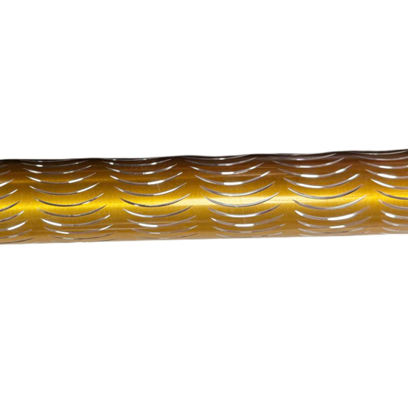 Dual Crescent Aluminum Curtain Rod for Large SpansAerospace-aluminum double S-bend rod with micro-arc oxidation finishes and a dual-keel structure, suited to panoramic windows and coordinated profiles.View Product →
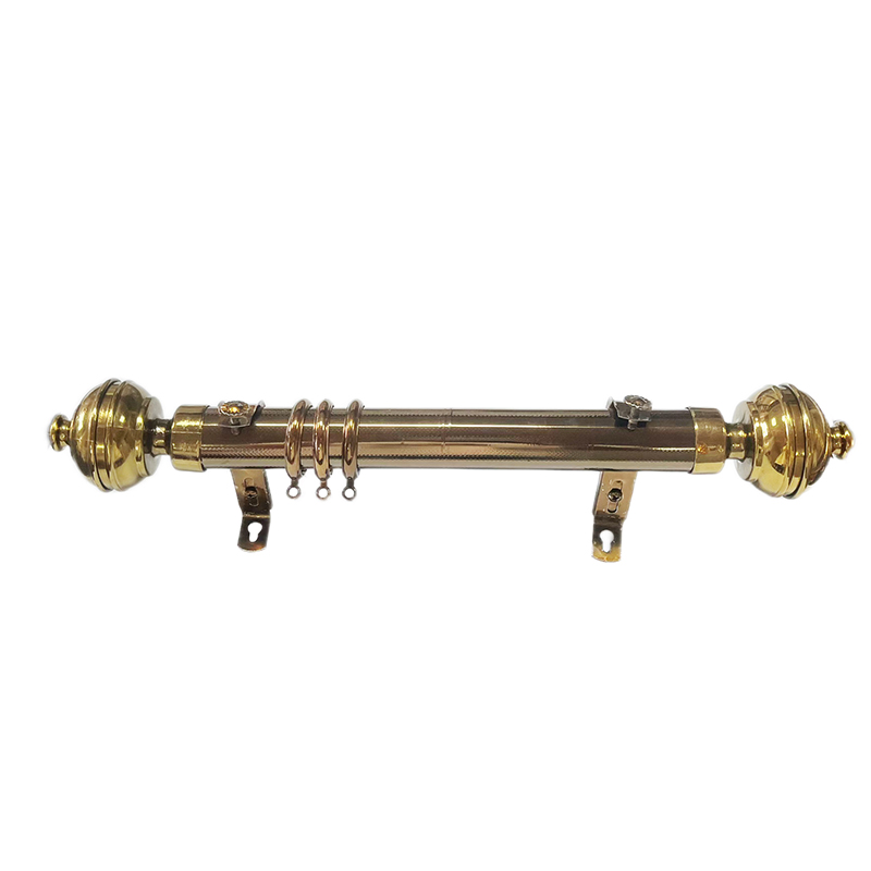
Profile also affects color perception. A slim, simple rod recedes; a shaped profile with a crescent curve catches light and can make the same color look lighter or more decorative. If the goal is a soft transition rather than a hard outline, test the profile with the actual curtain fabric, not a fabric swatch alone.
Match the Room’s Darkest Tone or Its Strongest Metal
A useful starting point is the darkest fixed color in the room: a black window frame, a dark wood floor, a charcoal fireplace surround, or a deep navy built-in. Repeating that tone in the rod creates a visual link without adding a new color. The second useful anchor is the strongest metal. If the room already has warm brass lighting, a cool chrome rod can look disconnected unless it is repeated elsewhere.
Check the wall and trim under both daylight and evening light. A warm bronze can turn almost black at night; a brushed silver can look nearly white under a cool lamp. Place samples vertically beside the window, not flat on a table. Curtain rods are seen against a vertical plane, and the contrast changes when the sample is held at installation height.
For whole-house projects, do not force one finish into every room. Carry a common logic instead: warm metals in living and dining areas, quieter neutrals in bedrooms, and a practical dark finish in high-touch family spaces. That approach keeps the palette coherent while respecting how each room is used.
Common Curtain Rod Colors and Where They Work
The table below is a quick screening tool, not a rigid rule. The right choice still depends on curtain weight, wall color, light direction, and the amount of visible hardware.
| Color or finish | Best use | Watch-outs | Buying note |
|---|---|---|---|
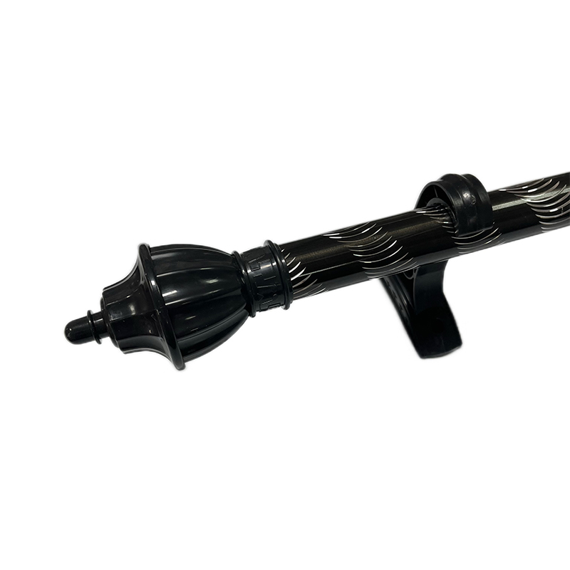
| Matte black | Modern, industrial, and high-contrast rooms; black window frames or lamp bases. | Shows dust and handling marks; can look severe with pale sheers. | Confirm whether the finish is painted, powder coated, or plated. |
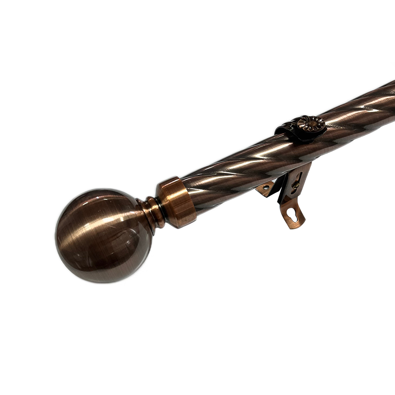
| Warm bronze | Traditional, earthy, and wood-rich interiors; warm curtains and brass accents. | Can look muddy beside cool gray walls; batch color varies more than black. | Ask for a production sample and compare cartons from the same lot. |
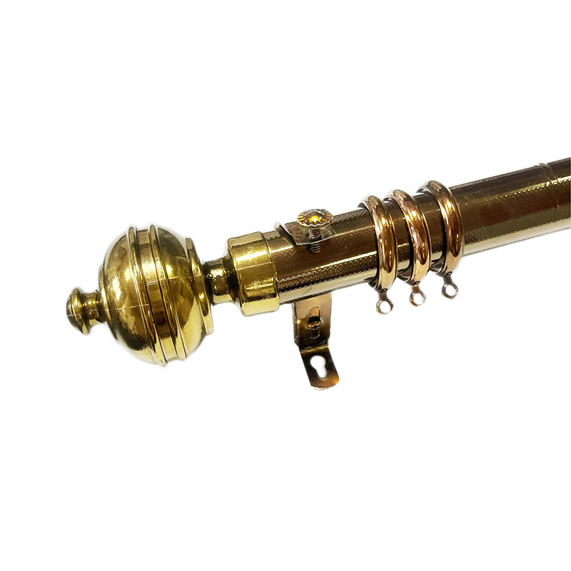
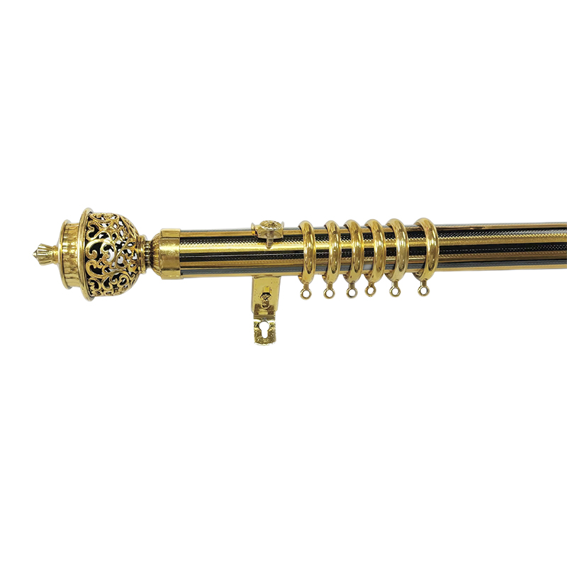
| Brass or gold tone | Warm decorative schemes, classic bedrooms, and rooms with brass lighting. | Bright gold can dominate; lacquer quality affects long-term appearance. | Specify sheen level: bright, satin, antique, or brushed. |
| Silver or nickel | Transitional, cool, and minimalist rooms; stainless appliances and chrome fixtures. | Can feel cold beside warm wood; fingerprints show on polished surfaces. | Choose brushed or satin where handling marks are a concern. |
| White or cream | Light walls and trim; a quiet, disappearing rod effect. | White can yellow or look gray in shadow; exact trim match is difficult. | Compare with the trim, not only the wall paint. |
| Woodgrain or film finish | Casual, textured, and warm rooms; PVC-wrapped rods with decorative surfaces. | Pattern scale can look busy; edges and joints need clean wrapping. | Check film adhesion, seam quality, and color consistency under light. |
Color Is Not the Same as Finish
Two rods can share the same color description and behave very differently. A powder-coated aluminum rod has a different surface depth from a plated steel rod, and a PVC-wrapped rod with a metallic film has different edge treatment from a painted rod. The finish affects sheen, fingerprint visibility, scratch repair, and how closely the rod matches other hardware.
In a purchase specification, separate these points: base material, coating or wrapping method, color reference, gloss level, and touch-up method. “Gold” is not enough. “Titanium gold sticker finish on a PVC-wrapped rod, low gloss, batch-matched to the approved sample” is a workable instruction. If the project has repeat orders, keep a physical master sample and state the acceptable color tolerance in writing.
 Gold Sticker Curtain Rod with Aluminum Alloy CoreFade-resistant gold-toned rod with high-strength aluminum alloy core, telescopic length and finial options; helps compare base material, coating and gloss.View Product →
Material choice also sits behind the color decision. Aluminum, iron, and PVC-wrapped rods hold finishes differently, and each has a different weight and installation profile. A useful comparison of aluminum, PVC-wrapped, and iron options can help narrow the substrate before the final color is approved.
For a broader technical comparison, see this curtain rod material guide before locking a finish schedule.
Sheen, Diameter, and Finials Change the Color
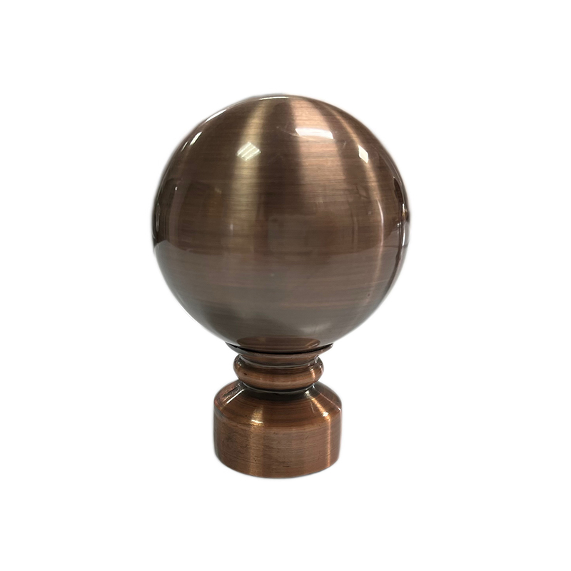
A matte finish absorbs light and reads darker and flatter. A satin finish softens reflections and hides minor marks. A polished finish reflects the curtain, wall, and window light, so its apparent color shifts throughout the day. In a bright south-facing room, a glossy dark rod can become a strong black line; in a dim bedroom, the same rod may almost disappear.
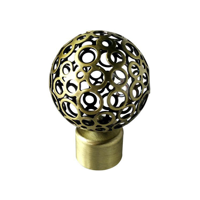
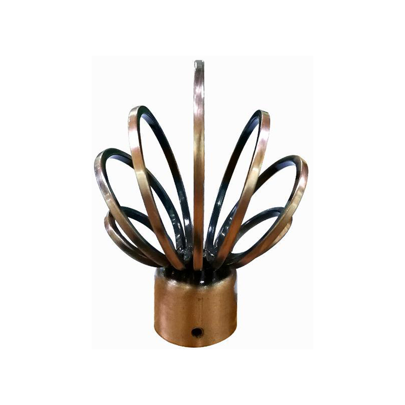
Diameter matters too. A thin rod in a dark color can look like a drawn line, while a larger diameter with a decorative finial carries more visual weight. The finial is the final color decision because it sits at eye level and catches light from the side. A simple cap keeps the rod quiet; a crystal or sculpted finial makes the hardware part of the design.
 Faceted Crystal Curtain Finial in Gold or ChromeK9-grade synthetic crystal finial with faceted cutting and oxidation-resistant metal base; a visible end detail to coordinate with rod and bracket finishes.View Product →
Use the same logic for brackets and rings. A perfect rod color beside mismatched brackets still looks unresolved. If the brackets must differ, make the difference intentional: conceal them behind the curtain return, or repeat the bracket finish in another visible detail.
Procurement Risks That Show Up After Installation
Color complaints often come from three avoidable gaps. The first is approving a sample under one light source. The second is mixing production lots without a batch standard. The third is ignoring the installation environment: coastal humidity, strong sunlight, and frequent handling all stress a finish differently.
Before a repeat order, ask for samples from the current production lot and compare them with the master under daylight and warm indoor light. Check edges, joints, and concealed surfaces, not only the front face. For wrapped or filmed rods, inspect the seam and end cut. For painted or coated rods, check for touch-up guidance and packing protection at the finial and bracket contact points.
Set a clear acceptance tolerance for color difference, gloss, and surface defects. A written standard protects both the buyer and the installer. It also makes the final choice easier: the rod color should support the curtain, the room, and the maintenance plan, not just the showroom sample.
A Practical Selection Sequence
- Decide whether the rod should disappear, relate, or contrast.
- Anchor the choice to the room’s darkest tone or strongest metal.
- Test samples vertically at installation height in daylight and evening light.
- Confirm material, coating or wrap, sheen, and batch tolerance.
- Check brackets, rings, and finials as one visible system.
For buyers assembling a full program, start with the curtain rod range and then narrow by finish and profile. The most reliable curtain rod color is the one that looks intentional beside the curtain, stays consistent across the order, and still feels right when the room is lit the way it is actually used.